Things in this Newsletter 🗞️
🌟 Editor's Note
Welcome to another Retro Newsletter. If this is your first time here, I highly recommend reading this newsletter first it will give you the basics. The main idea today is actually about Radar charts or Spider charts, but I only had a great pic of a spider. So the Spider chart retro.
🌟 Continuous Improvement ideas
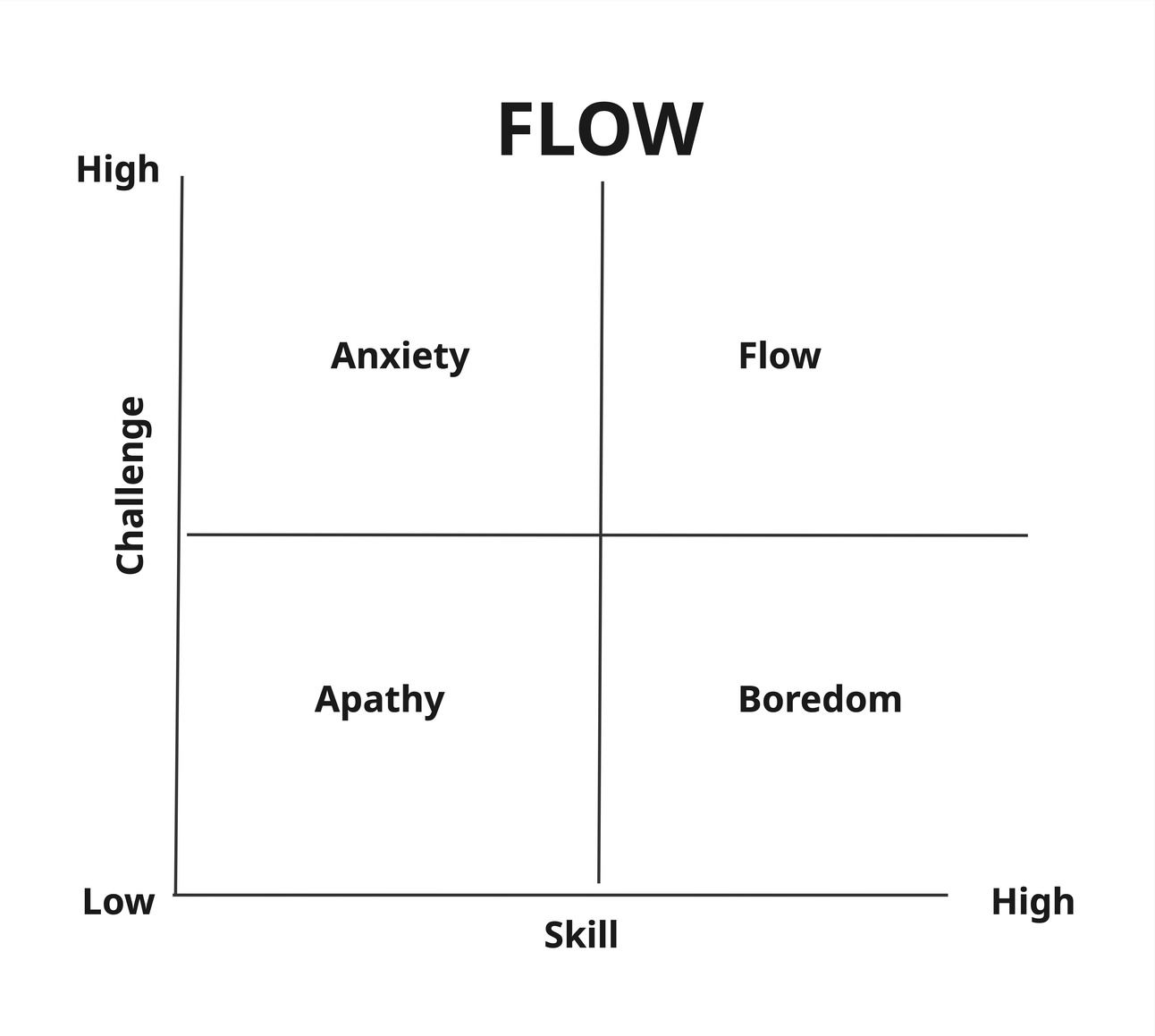
One of my friends works on a team of developers at a start-up. They all work in 25-minute pomodoros together.
Every 25 minutes, they pause and do a quick reflection of how much in ‘FLOW’ they were and what would help them to get more into flow.
They use this matrix as a way to rate their experiences.

Flow
🕸️ The Spider Chart Retro: A Visual Way to Reflect
Something that works well to create a visual representation of where a team sees itself from different perspectives is a Spider Chart. It’s simple, visual, and packed with insights.
I usually do a set-the-stage exercise to link into whatever we want to dive into on the spider chart, then..
Here’s how it works:
Start by drawing a star diagram with 4 to 6 arms, depending on how many things you want to dive into.
Label each arm with a different aspect of the team's experience. Some good ones include:
Team Collaboration
Technical Skills
Technical Stack
Code Quality
Process Quality
Product Understanding
You can adapt these to fit your team, just make sure each label represents something meaningful. And you can align them all to a theme, for example, if you wanted to focus on the technical aspects, you could have things like Unit testing, TDD quality, Code coverage, and overall code quality. Sometimes, less is more; the more things you add, the more sticky notes you will get.
Next, ask each team member to rate the team on each axis out of 4 or 5. This can be done silently with sticky notes, digitally with tools like Miro or MURAL, or even drawn on paper if you're in-person.
Once everyone has rated each item individually, you can collect all the answers and create a visual.
When you connect the dots, you get a shape. That shape is data. And not just any data, it’s shared perception, and the starting point for a great conversation.

Spider chart example
What you’re looking for isn’t a “perfect star.” You’re looking for asymmetry—for the conversation that follows
Generate Insights
Now you have a great starting point to generate insights. Resist the urge to find a solution for the lower scores.
Rather, start by inviting the team to observe patterns:
What’s surprising or unexpected about the shape?
Where is there alignment, and where are there big gaps?
What areas have changed the most since last time (if you’ve done this retro before)?
Now, rather than jumping to solutions, pause here and step into double-loop learning.
This is the perfect time to help the team explore not just what they rated low, but why those ratings are what they are.
Ask deeper questions to surface underlying assumptions, team norms, and mental models:
What does a "5" look like to us in [Team Collaboration]?
Why do we believe this score is acceptable—or not?
How have our habits or unspoken rules shaped this rating?
What expectations do we have around [Code Quality/Process Quality], and where did those come from?
What are we not talking about that might be influencing our scores?
This moment is powerful. It helps the team move beyond surface-level feedback (“our tooling sucks”) and into reflective, systemic thinking (“we value speed over refactoring—why is that, and is it still serving us?”).
Encourage curiosity, not judgment. One of the best questions you can ask here is:
“What would we need to believe in order for this current state to make sense?”
That one often opens things up.
You can also bring in a quick activity here to help the team walk backwards through their reasoning around one axis. Choose an area with diverging scores and have people share their conclusions, then trace back to the data, interpretations, and assumptions that led them there.
Once you have pulled all of the meat out of the data, you can start thinking about what to do. Get the team to vote on things that are important or impactful, but sometimes what comes out of a Spider chart are deep insights about where the team thinks differently about how they do something or why they do something, and so the insights and the learning are often the shift.
Give it a try and let me know what you use on your Radar.
🧠 Quick Facilitator’s Tip
1. Open with connection
How you open your meeting can have a big impact on what happens inside the meeting. Thinking about and being intentional about your opening can set a stage that is collaborative or conflicting. So take a few minutes and open with warmth and connection.
🔥 Things you might like
I found this cool Miro board of fun icebreakers for Introverts.
Beehive is a fantastic newsletter platform that is so easy to use and makes it fun and easy to engage an audience if you have something to say. Why not think about starting your newsletter: https://www.beehiiv.com?via=Joanne-Perold
Did You Know? Wind Farms are losing wind.
Simply put, as the spinning turbines of a wind farm take energy from the wind, they create a wake and slow the wind beyond the wind farm. - The unintended consequences of what we do.
Till next time,


